The Vicinity Apartments: In The Center–Off The Grid
INSIGHT
Our client Sherman and Associates envisioned a boutique residential community designed for professionals seeking the energy of downtown living with the comfort and character of a more personalized experience.
While initially focused on women, the concept expanded into a broader message of being “at the center of it all,” inclusive yet subtly feminine in tone.
SOLUTION
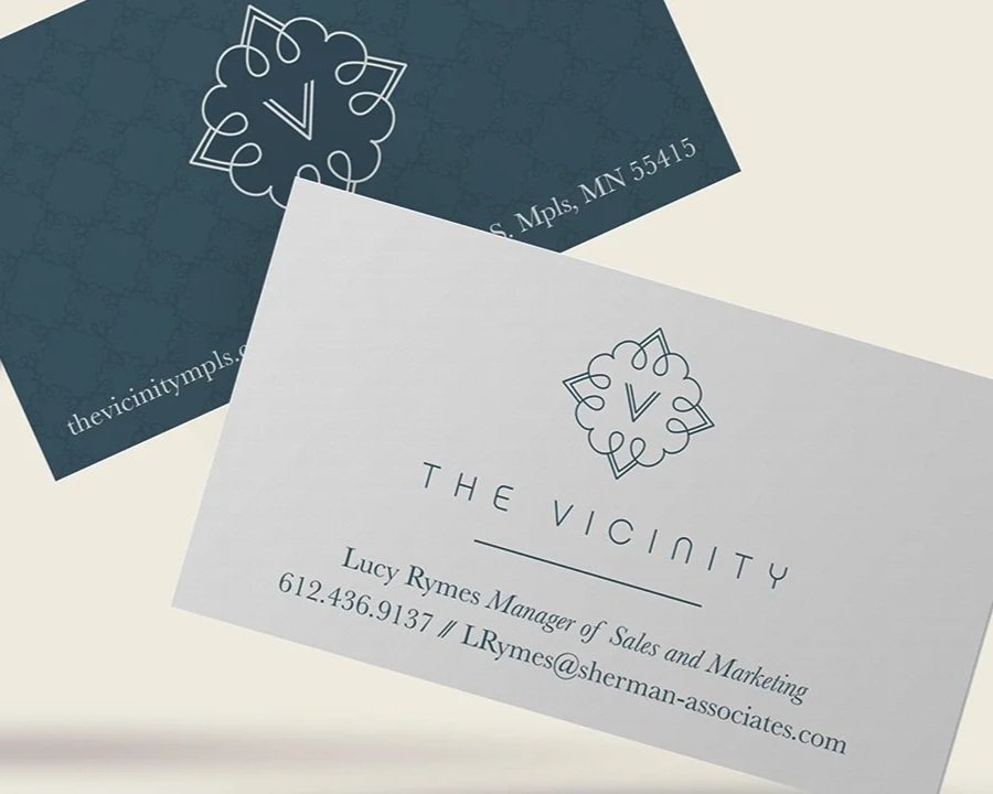
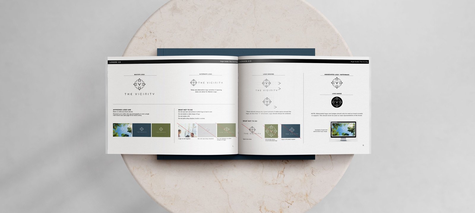
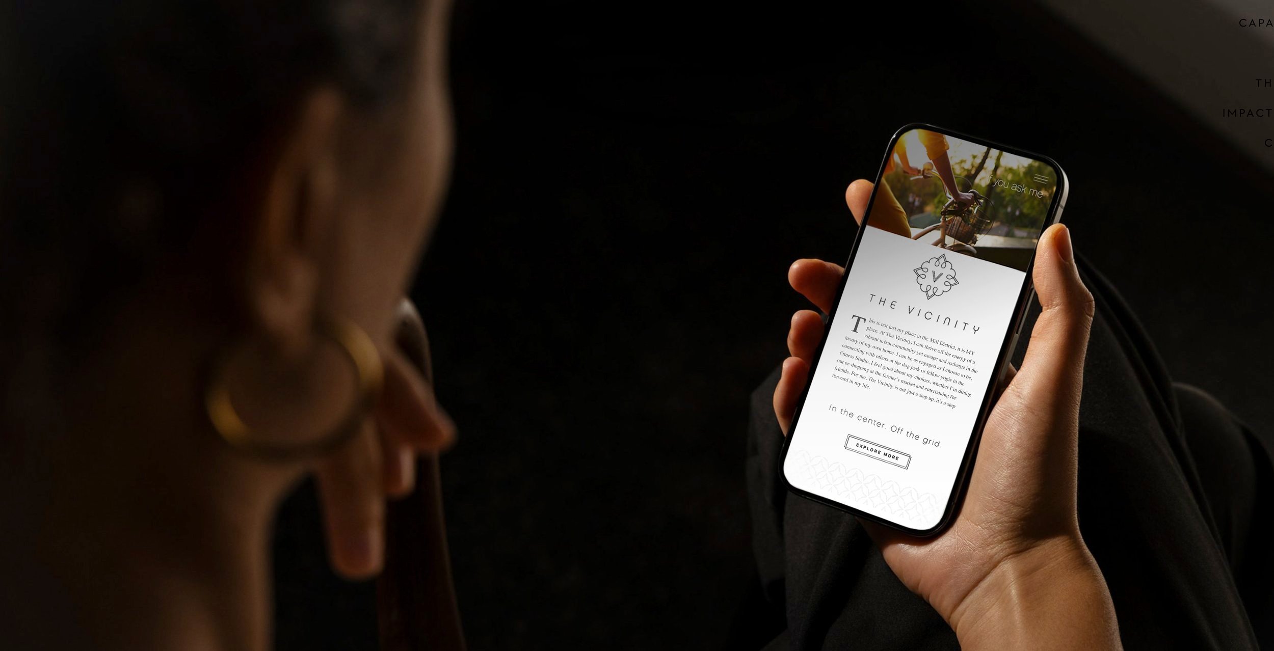
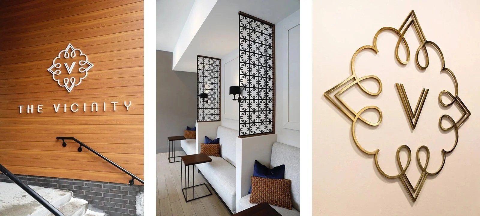
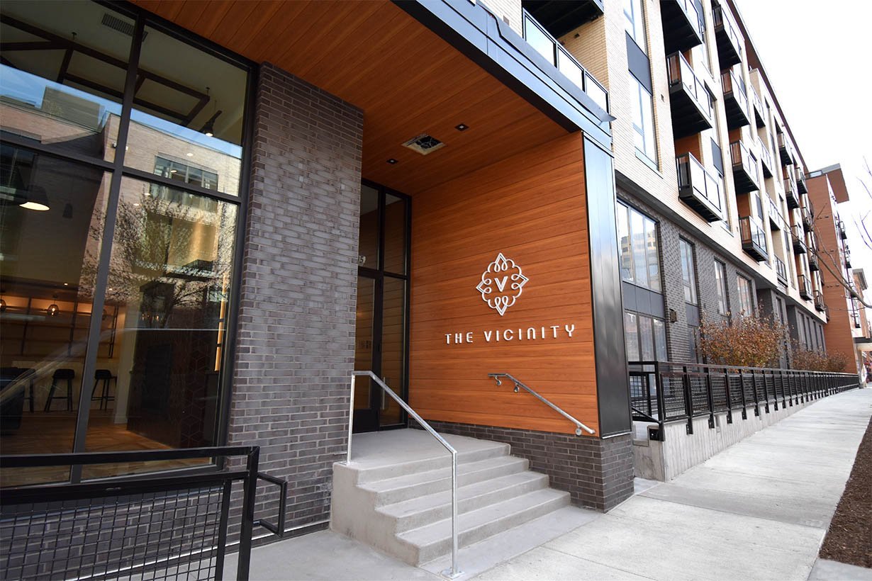
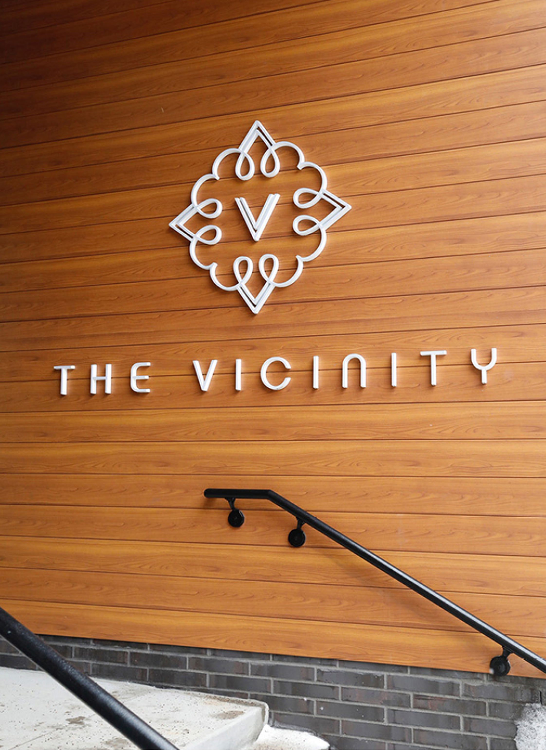
We created a distinctive brand mark inspired by a compass, striking a balance between sophistication and approachability. Custom iconography highlighted key amenities, while branded design elements like ironwork and mosaic tile patterns were thoughtfully integrated throughout the living environment to create a sense of place. To bring the brand to life, we produced lifestyle photography and a landing-page video that captured the energy, convenience, and spirit of living at The Visinity, perfectly positioned in the center of it all, yet with a feeling of being just off the grid.
RESULTS
Sales exceeded expectations, reaching 80% occupancy within the first three months.
Originally produced at Flygirl Creative.